
Working within government involved strict protocols in terms of development and UX design. Content, code and UX elements all had guidelines to follow. These components were developed to ensure they worked in both of Canada's official languages and met AA or AAA accessibility criteria.
Best practices
As part of The Government's design standards and practices, I closely followed the governments style guide in order to ensure consistency in components, accessibility and best UX practices.
Components have very specific use cases and requirements. Following these guidelines allowed me to focus my time and research into using these components in creative sequences for efficient workflows across my teams' applications and systems.

Accessibility, design and language
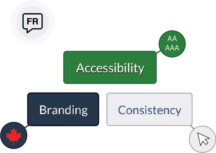
While working with the government's style guide, I learned the importance of the balance between accessibility, branding and consistency. On top of those key factors, I also had to incorporate French as well. All designs and development needed to work in both English and French as a mandatory requirement. I worked with content experts to make sure language within our applications made sense for both languages so all users have the same experience.
Questioning and re-inventig

While these requirements were standardized by the government, I was able to connect with various departments in regular critique sessions where we were able to question the use of these components and elements within our designs.
What is this element truly used for?
Can the accessibility be improved?
How can we make this more functional based on my user research?
As technology evolves, it is important to take initiative and question whether or not these components can be improved. Reaching out to the appropriate departments in charge of the design system allowed me to explore the potential of working outside of the box when our applications needed it most.


